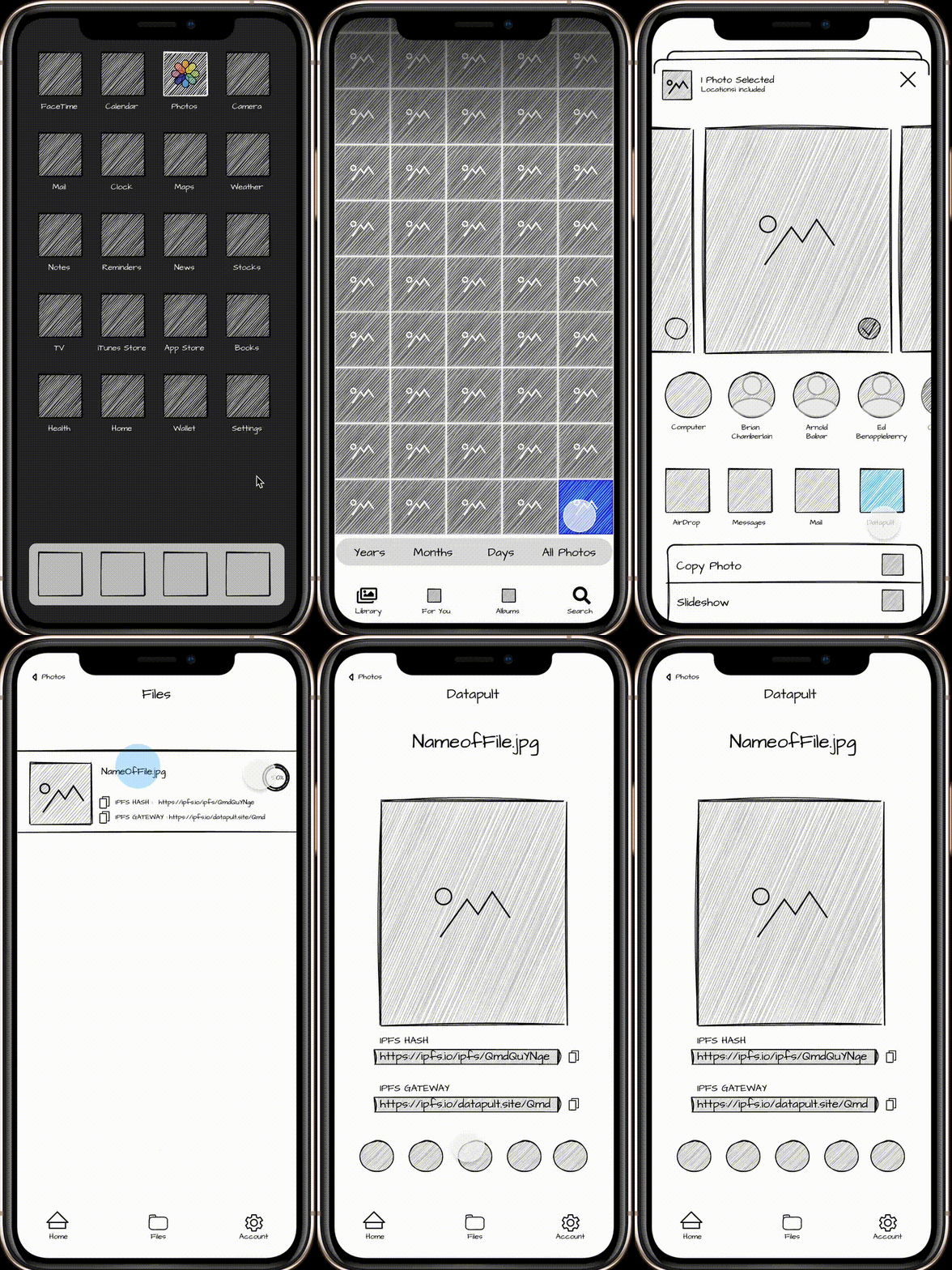
As we are working through the design concept of Datapult it is helpful to put together screens we have designed and animate them. This gives a better sense of what the app does (and doesn’t do). When showing it to potential users it really helps make it feel more real without giving them the sense that the app is done. I especially like hand-drawn looking UI mockups for this purpose. There’s something about it that feels incomplete and I like how every pixel of the image communicates WORK IN PROGRESS. It is that aestetic quality that welcomes more constructive feedback.

The mockup
In the mockup we are trying to also show the larger context of the usage of Datapult. We feel that there’s a desire for people to use Web3 for more of their day-to-day. One very common task on a mobile device is sharing a photo. We hope that we can convince people to use Datapult to share photos when they post them on social media.
The walkthrough goes as follows:
- User opens photo app
- Chooses photo to share
- Share Extension in iOS slides up
- Datapult app is a share extension option
- User chooses Datapult
- They confirm the image to share
- The app uploads the image to IPFS and filecoin network
- The image share link is availble on the image and can be copied to Twitter, LinkedIn, etc…
Thoughts? Questions?
We’re still working through this concept and app so any feedback or thoughts are welcome. Connect with us on Twitter or through the feedback form on this page below. If you’re not familiar with the Datapult project you can read more about it here. Follow along on Twitter when we drop updates here on our website.

